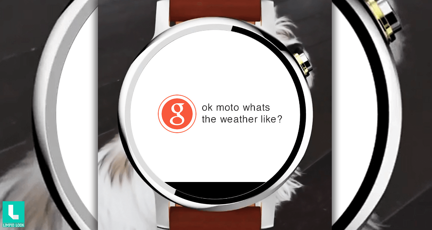
A lot of people have been waiting for the Moto 360 2nd gen. Today Motorola accidentally shared a short video on their official Instagram account that looks like a part of Moto 360 2nd Gen teaser in which we can clearly see the design of Moto 360 2nd Gen. Motorola deleted that video afterwards but we saved it for you. Watch the video yourself.
The new Moto 360 2nd Gen looks more like the Huawei watch which is yet to release late this year. You can see a watch that looks similar to the original Moto 360. The changes included the watch button placement. Now Motorola have changed the placement of the watch button as users were complaining that the button itself presses by touching the wrist when they fold hands. Moto 360 2nd gen now has lugs attached to its round body that hold watch bands.
The original Moto 360 has no band lugs and instead hosts watch band attachments underneath the body of the watch. Which we think that Motorola have decided to change because Many people complained about the cracked back cover of Moto 360 which is caused by the pressure of the steel bands. The other thing we noticed is the design of bezel which is now changed a little bit. The only difference in the software we see is that instead of OK Google now it has OK Moto.
What we believe is that the new Moto 360 2nd Gen just look very similar to the Huawei watch. What are your thoughts about the new design on Moto 360 2nd Gen. Do tell us by posting a comments in the comment section below.


Add comment