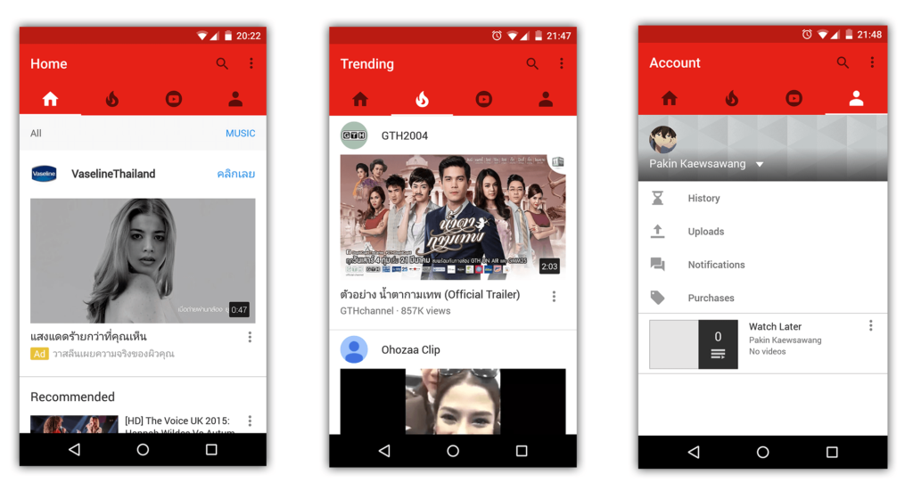
Number of users are encountering a new YouTube interface. The new app Ditches The Hamburger Menu. The new user interface is seen on Android devices running lollipop. Android Police reported that the update is triggered automatically via server-side without an actual play store app update. We don’t know yet that which version of YouTube is being updated.
The change sees YouTube’s hamburger menu flipping right out of the interface, going the way of Google+ in discarding the left-side navigation drawer. Instead, users are given four primary tabs – Home, Trending, Subscriptions, and your profile. Interestingly, a couple of these tabs seem to have bars underneath to switch from, say, all videos to music on the home tab, or from uploads to channels on the subscription tab. Besides these changes, things are ostensibly working just like before.
For now it’s unclear whether this change is destined for a wide rollout or just an A/B test, but if the interface is as easy to use as it appears, it may be a welcomed change. After all, the nav drawer in YouTube’s current iteration includes a considerable 17 items not counting playlists or subscriptions. Add those in and my personal nav drawer has 60 entries.
This new user interface will allow YouTube App to actually look like a social network. Now we have to wait and see when google officially launch and update all its current YouTube apps.
Via Android Police


Add comment